Understanding CSS Grid
Posted on: June 21, 2025 | Author: Abdul Rauf Azhar
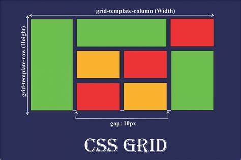
CSS Grid Layout is a powerful 2-dimensional layout system that gives developers full control over rows and columns in responsive designs. Unlike Flexbox, which handles layout in one dimension at a time, CSS Grid allows you to place items into a structured grid — just like a spreadsheet.
You can define grid containers, create responsive columns with `fr` units, align items using `justify-content` and `align-content`, and even create complex layouts with minimal code.
Why Use Grid?
- Build multi-column layouts easily
- No need for float or inline-block hacks
- Works well with media queries and Flexbox
Try combining Grid for layout structure and Flexbox for internal element alignment to create modern and efficient designs.